Reminder! The final deadline for all assignments other than the final policy brief is Tuesday, December 10 at 11:59 PM
Data-based essay
Due by 11:59 PM on Thursday, September 26, 2024
Instructions
Use data from the OECD, World Bank, Varieties of Democracy (V-Dem) project, or Quality of Governance (QoG) project to compare some aspect of the public sector across five countries. These data sources include information about public sector labor force participation, gender proportions in bureaucracy, civil society openness and restrictions, human resource management policies, and a host of other public policy and management issues.
You will select one public sector issue and five countries and collect the relevant data on the issue for at least the past ten years (if available). You will then summarize and visualize trends in the data and draw conclusions about the issue in these countries. You will conclude with a discussion of what the trends in these five countries might mean for the public sector in other countries.
Your essay should be a minimum of 1,250 words. Broadly speaking, your essay should include:
A justification and summary of your chosen issue area and data source—why does it matter, and why should we care about what it looks like around the world?
A justification for your five chosen countries—why these? are they representative of general regime types or regions?
A graph and/or table showing changes in your chosen measure over the past decade
A discussion and speculation of why the measure has changed over time—try connecting changes to political changes, civil conflicts, or economic developments
A discussion of what these trends might mean for the public sector more globally
You will submit this essay via iCollege.
Grading
I will grade this essay using this rubric. I highly recommend that you refer to the rubric when writing the essay!
The detailed country-year data from QoG, V-Dem, the World Bank, and other sources is structured in a way that makes it easy to work with statistical software like R and Stata. However, with the knowledge of some extra features (like filtering and data querying) it’s possible to work with it using Excel.
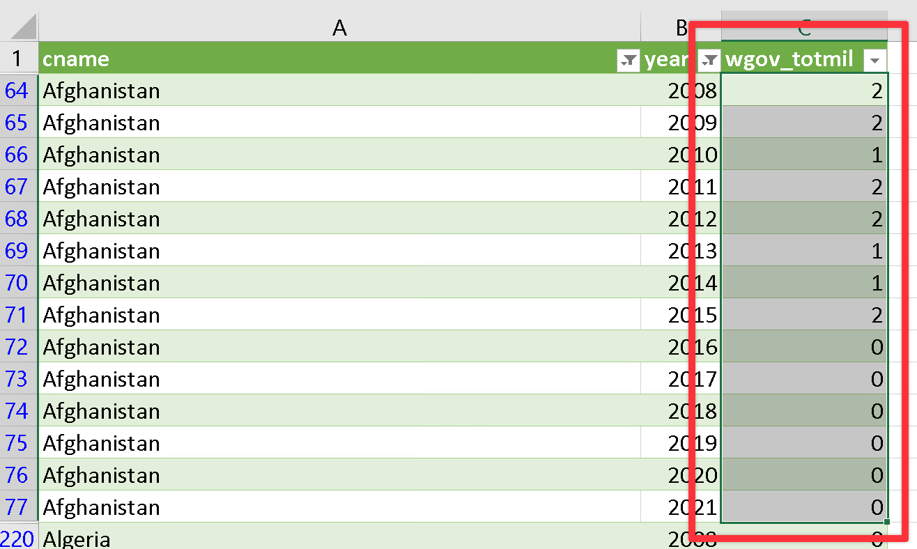
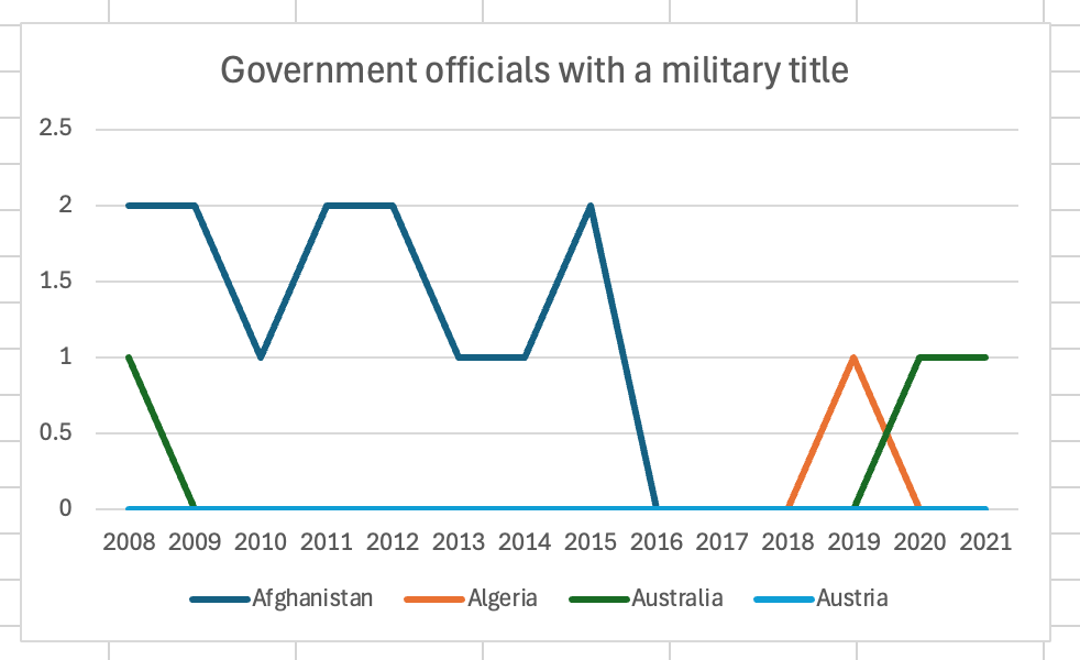
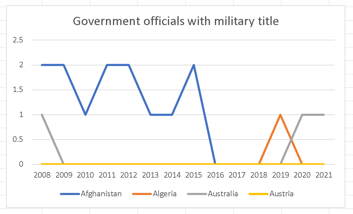
In the example below, we’ll create a chart of the number of government officials with a military title (wgov_totmil) from the QoG project. Don’t use that indicator for your essay—this is just to show the general process.
In the navigation bar on the right of the page, download the CSV file for the Time-Series data (the Cross-Section data is for only one year).
In the navigation bar on the right of the page, download the codebook as well. You’ll need to refer to this to see what columns you might want to work with.
Import the data into Excel
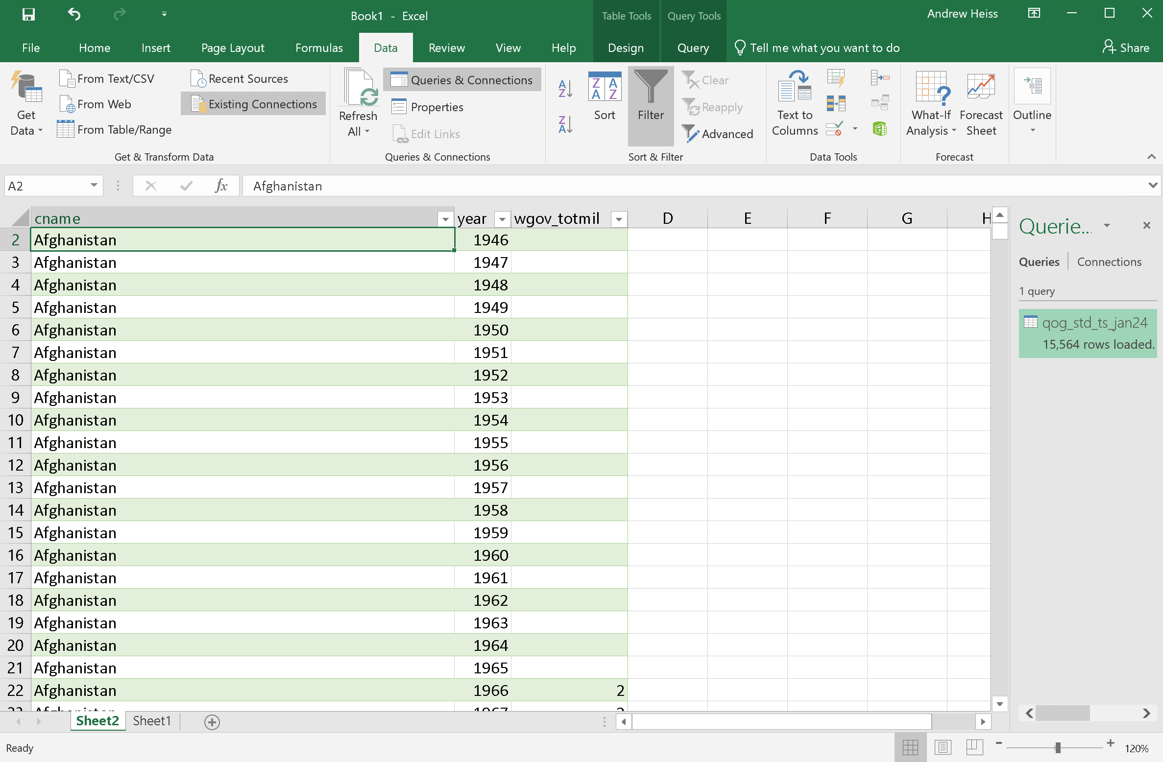
The QoG’s standard time series CSV file is 70+ MB large. You can open it directly in Excel if you want, but it’ll be slow and a little unwieldy—it has nearly 2,000 columns and more than 15,000 rows!
A better approach is to import a subset of the data into Excel and work with that instead. Using Excel’s “Power Query” feature, you can import only the columns and rows that you are interested in and ignore everything else.
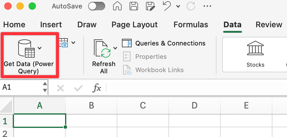
Open a new Excel workbook.
In the Data tab in the menu ribbon, select “Get Data”. This lets you connect Excel to a bunch of different types of data sources. You want to connect Excel to the big QoG CSV file you just downloaded.
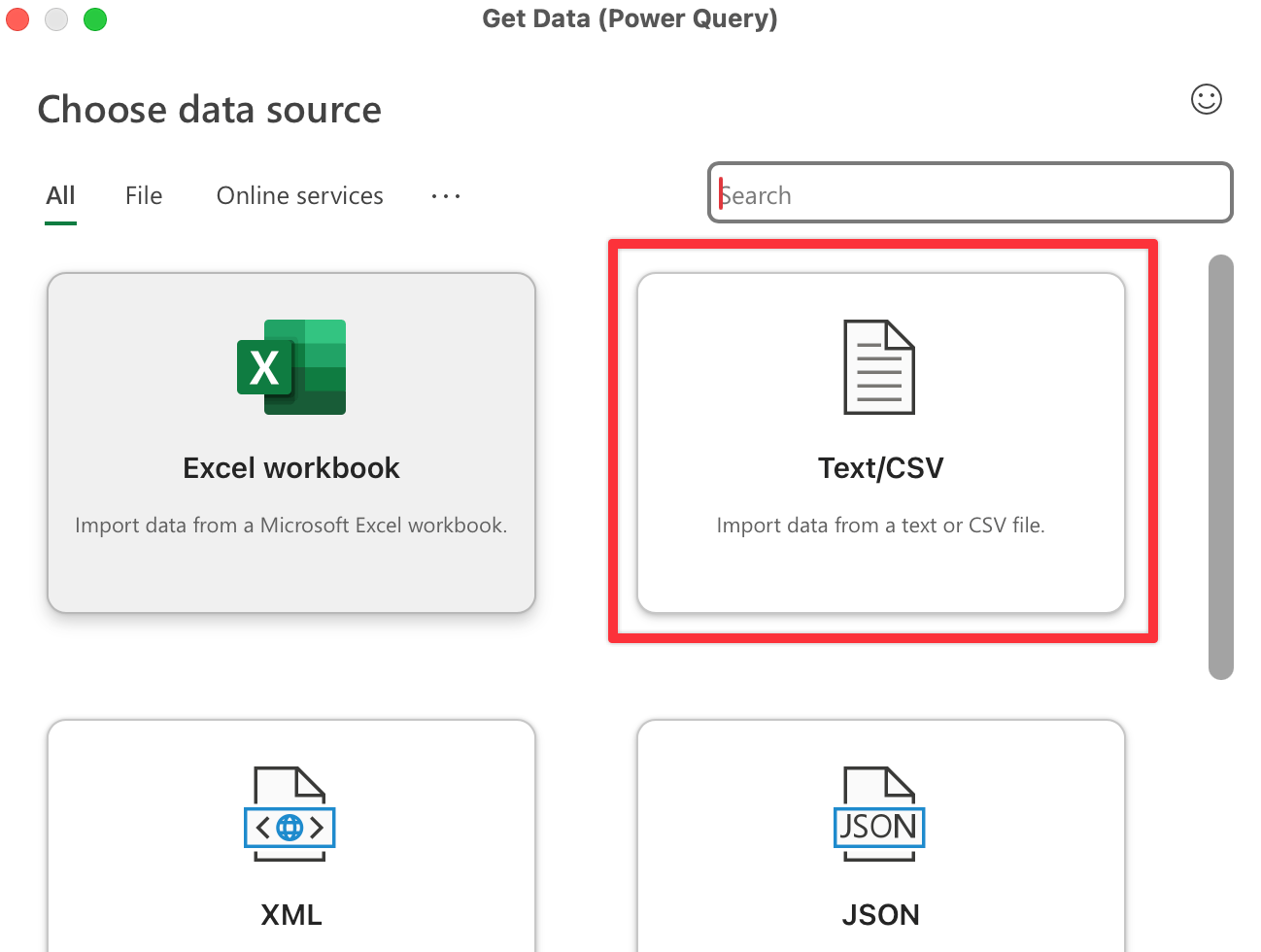
On macOS, click on the “Get Data” button, then select “Text/CSV” as the file source. Navigate to wherever you put the QoG data on your computer.
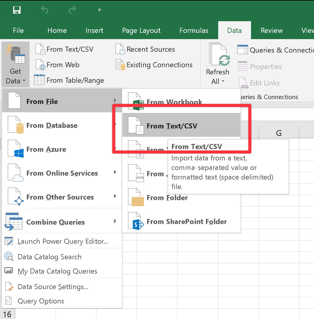
On Windows, go to “Get Data” > “From File” > “From Text/CSV” and navigate to wherever you put the QoG data on your computer.
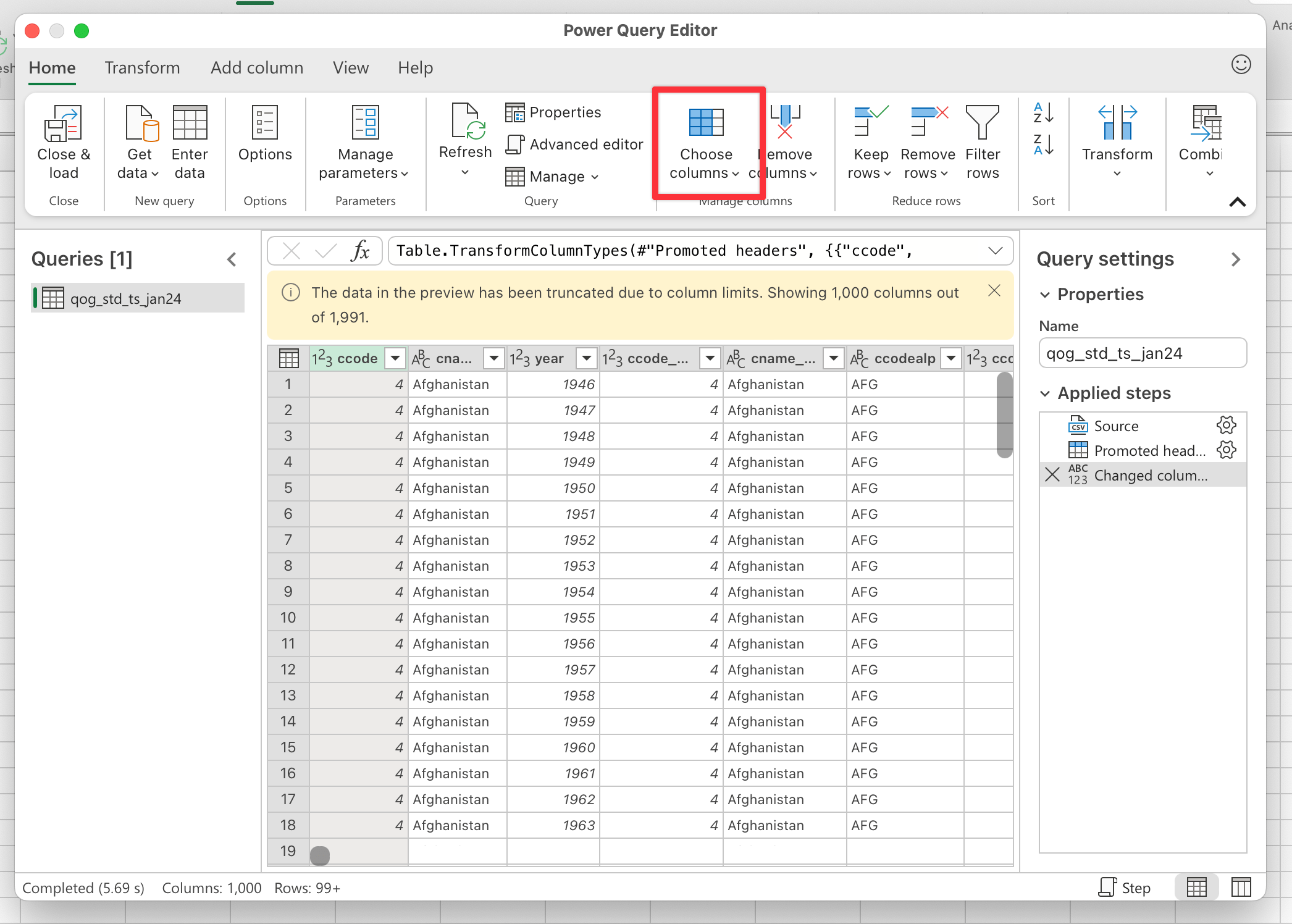
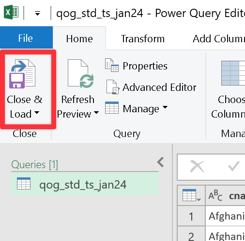
Excel will load a preview of the data into a window. Don’t actually click on the “Load” button in that window though. You need to tell Excel which columns/rows to import first. Click on the “Transform Data” button instead:
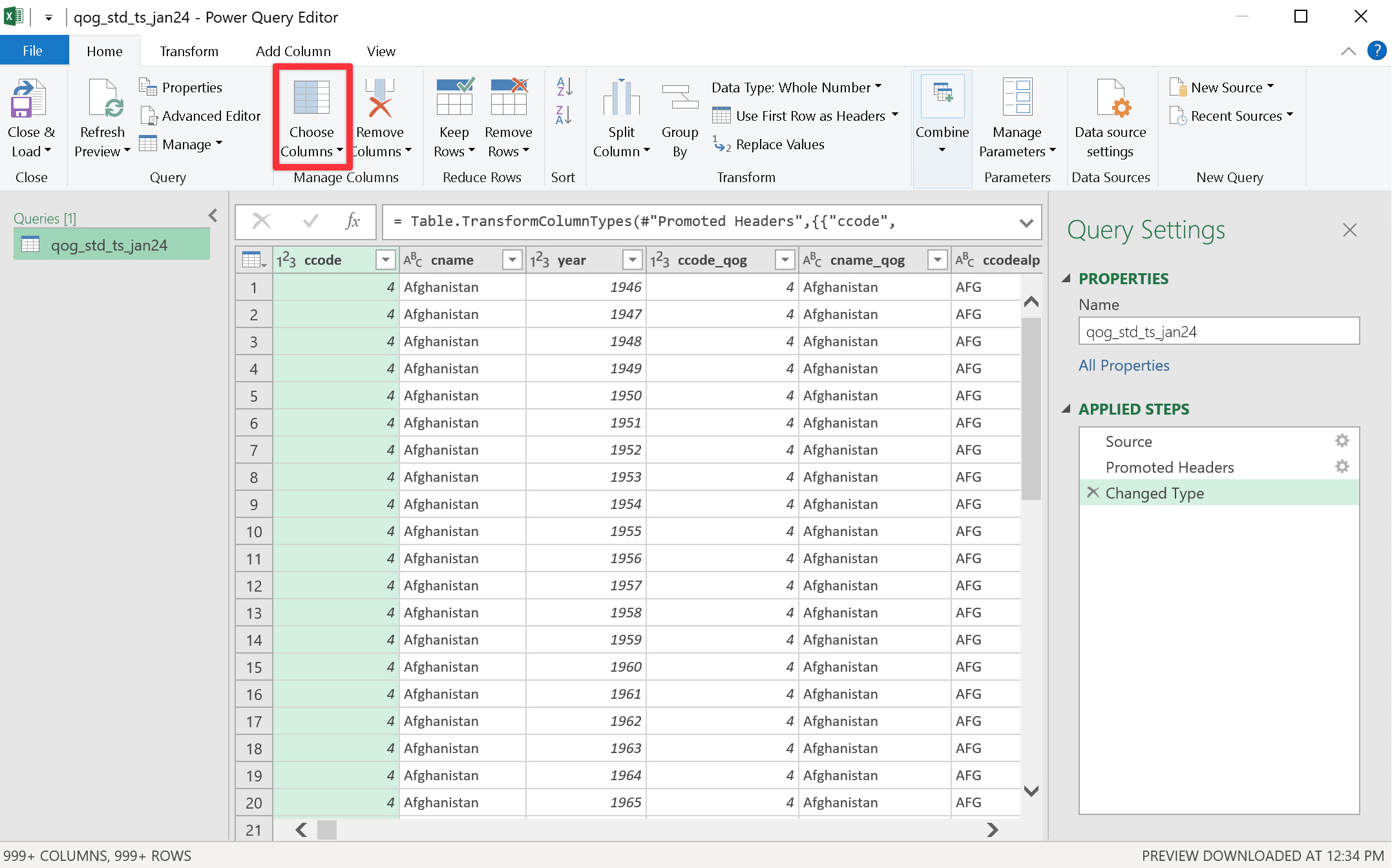
The Power Query Editor should open, which lets you select and filter and manipulate the data before importing it to Excel. Click on the “Choose Columns” button to select which columns to keep.
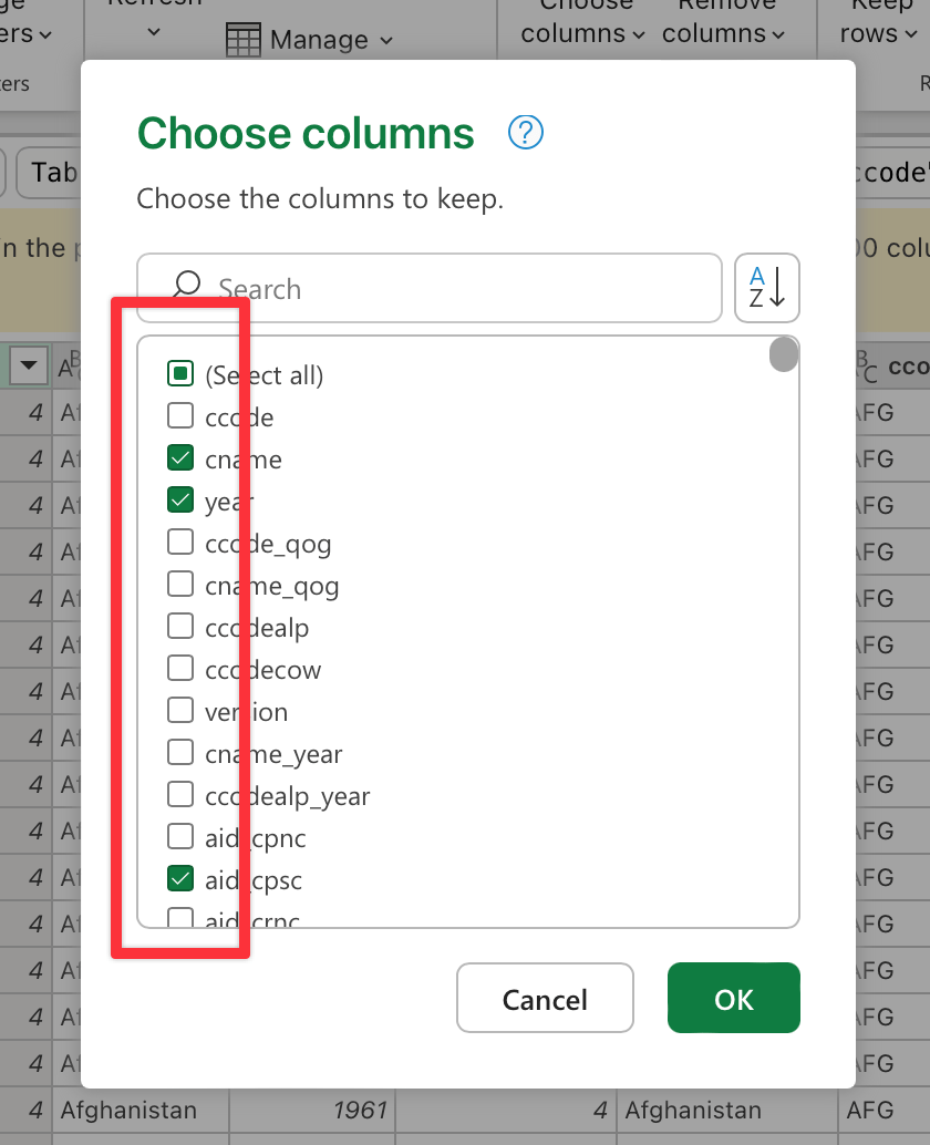
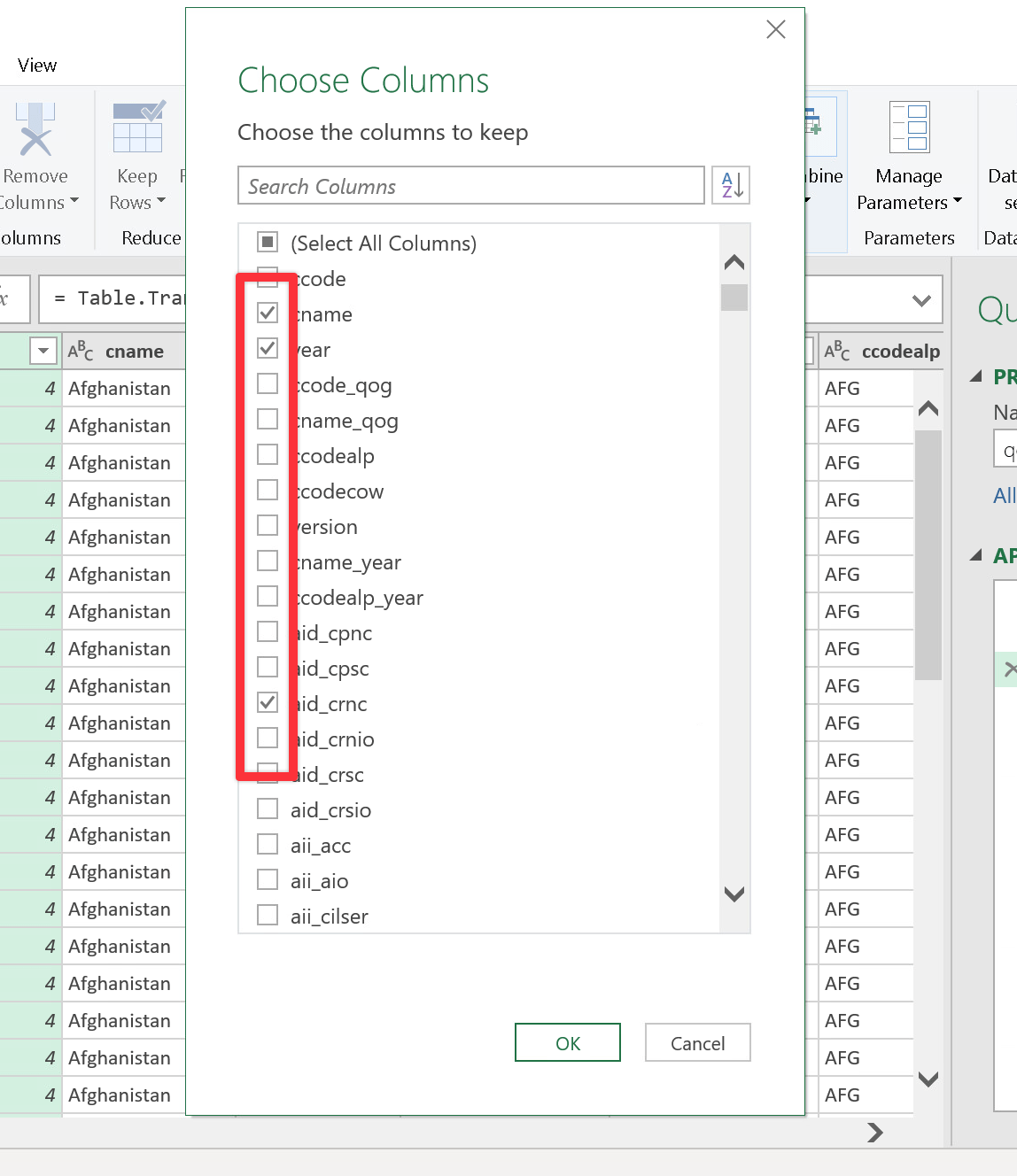
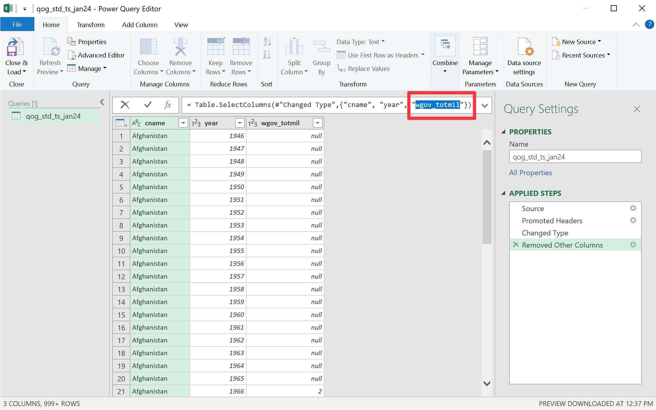
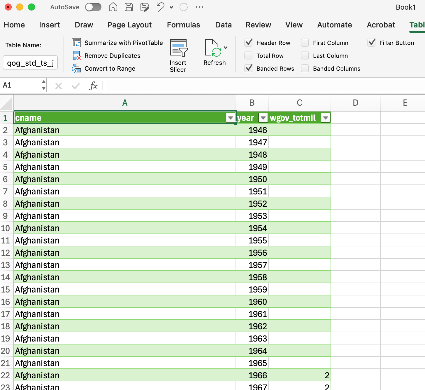
You’ll definitely want to keep the country name (cname) and year (year) columns. The list of columns only shows the first 1,000 columns, so if you’re interested in a column that comes later in the alphabet (like wgov_totmil, which we’re working with in the example here), you won’t be able to select it here (or even search for it!). Instead, select some other column, and we can adjust it later.
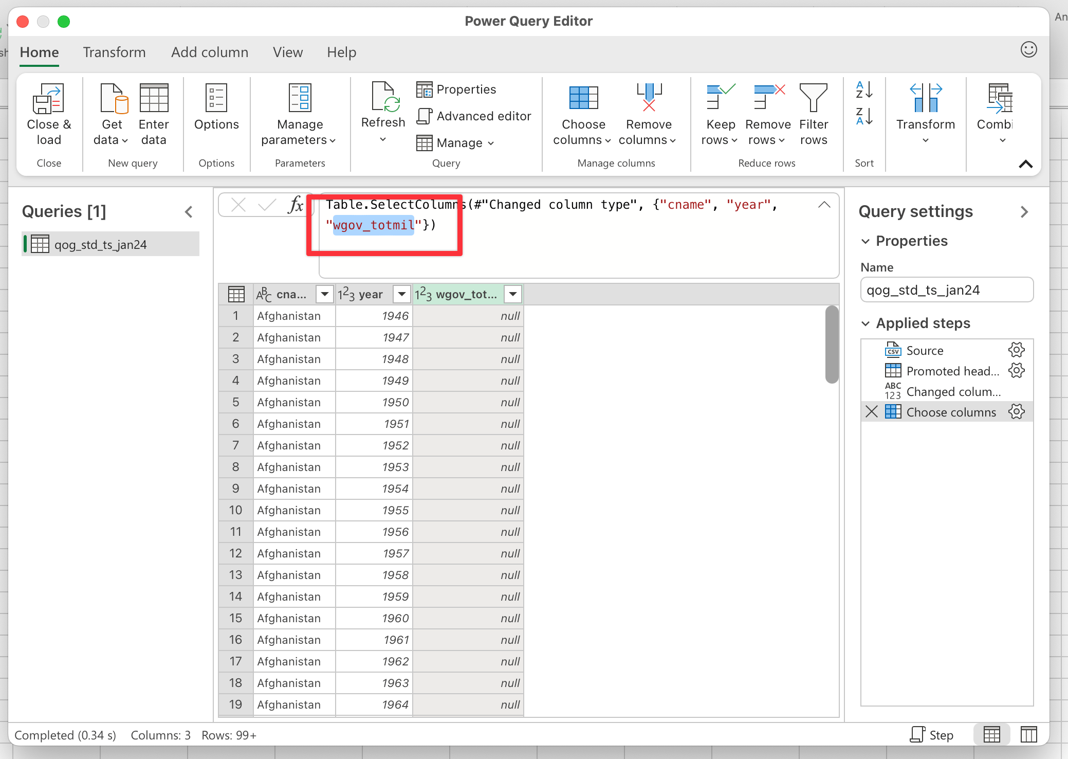
After you’ve selected those columns, you can adjust the underlying code for the query and select the column(s) you actually care about. Here I changed the random aid_cpsc column to wgov_totmil:
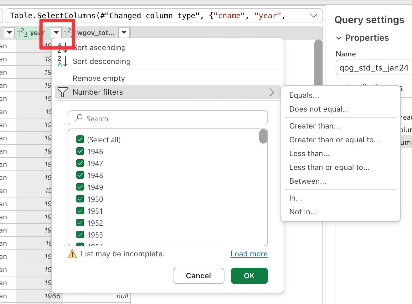
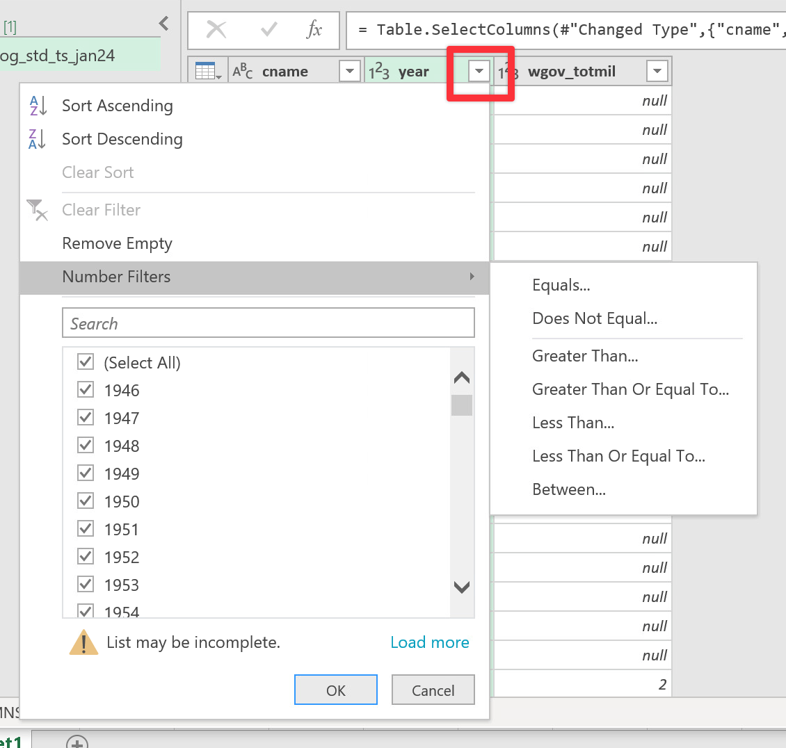
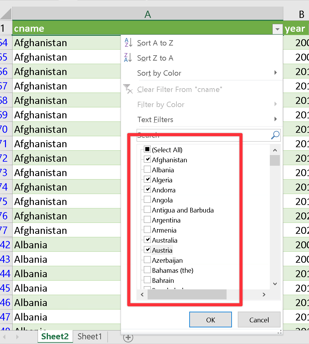
If you want, you can also filter the rows that you import. For this assignment you’re working with (at least) five countries over (at least) ten years. You can click on the little dropdown menu in the column headings to specify different filters, like specific countries or a range of years.
You can also import all the rows and do this kind of filtering later in Excel itself. Either way is fine.
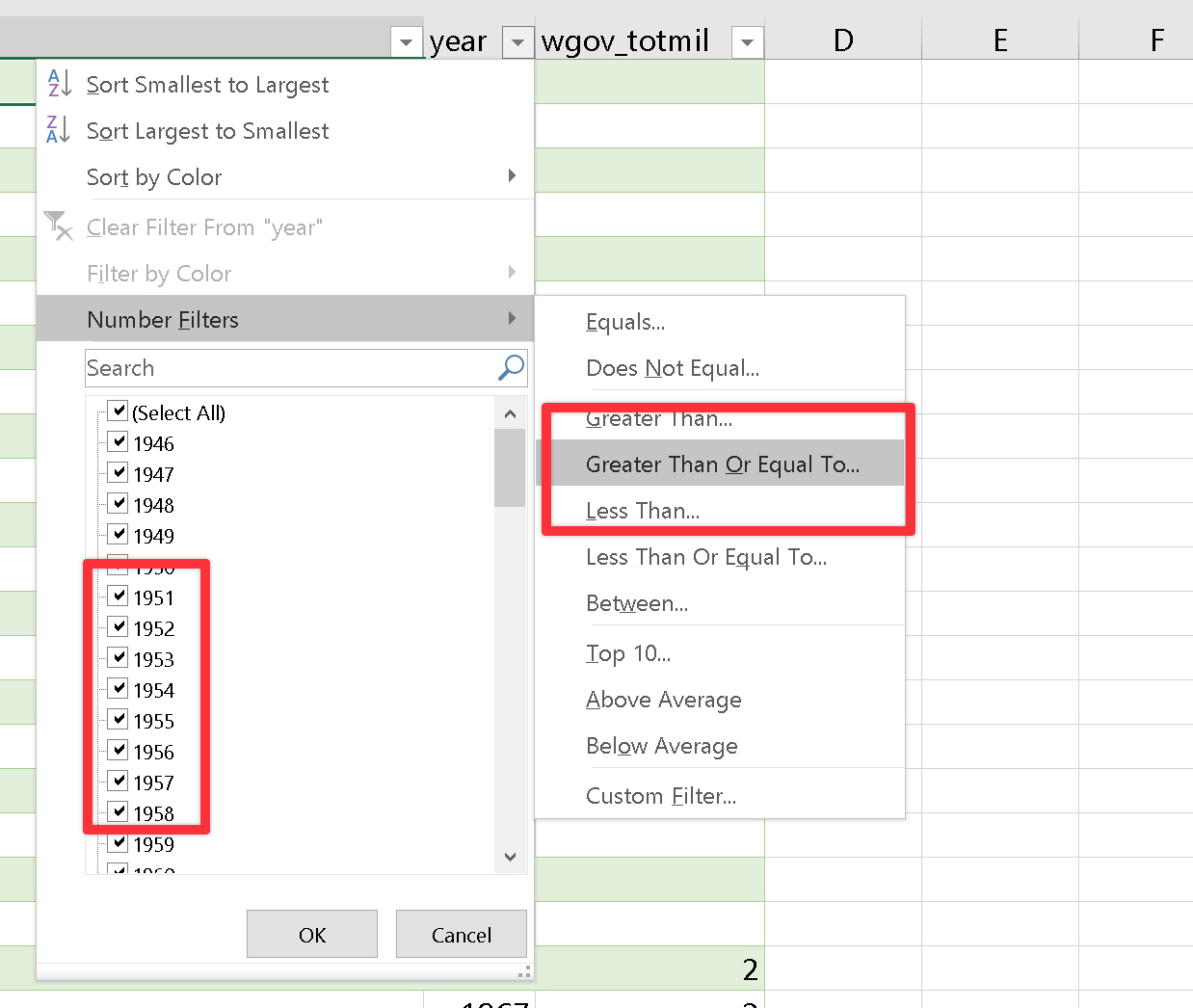
Excel has the ability to filter data based on all sorts of different conditions (exact name matches, being less than or greater than some value, etc.) using dropdown menus in the column headers. If you didn’t filter the data when importing it, you can filter it in Excel.
Enabling filtering
The data that you import from QoG should already be set up for filtering—you can tell because there are little dropdown menus at the top of each column. If you’re working with other data that doesn’t already have those dropbown menus, you can add them by going to the “Data” tab in the menu ribbon and then clicking on “Filter”.
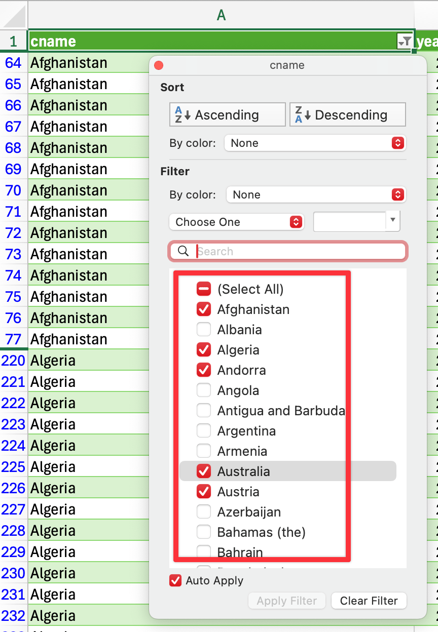
You can filter the country column by checking the boxes next to whichever countries you want to include.
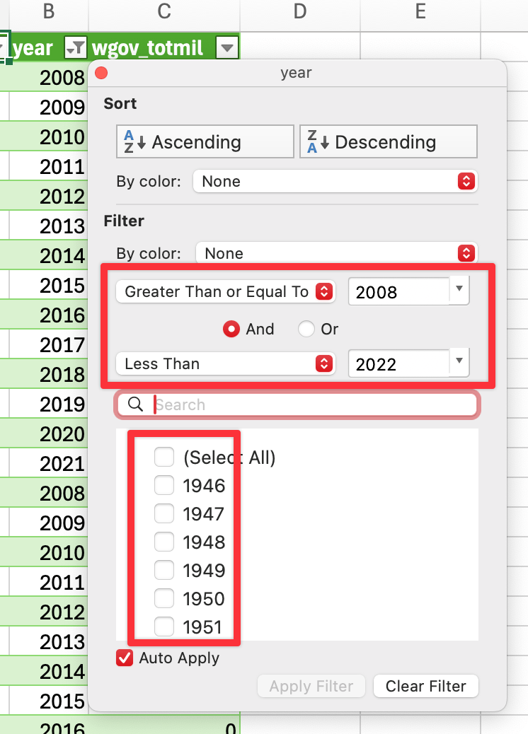
You can filter the year column by checking the boxes for each year, or by creating a range, like 2008 ≥ year < 2022 here. (You shouldn’t necessarily use that exact range in your assignment! That’s just an example here! Use whatever range you’re interested in!)
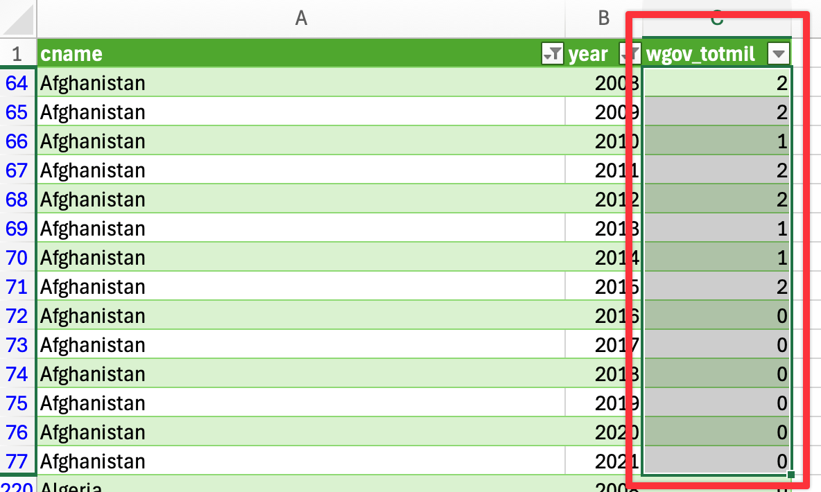
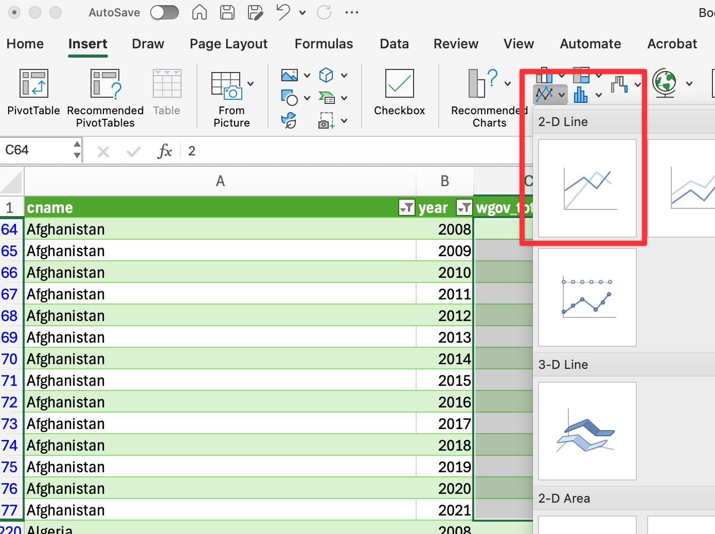
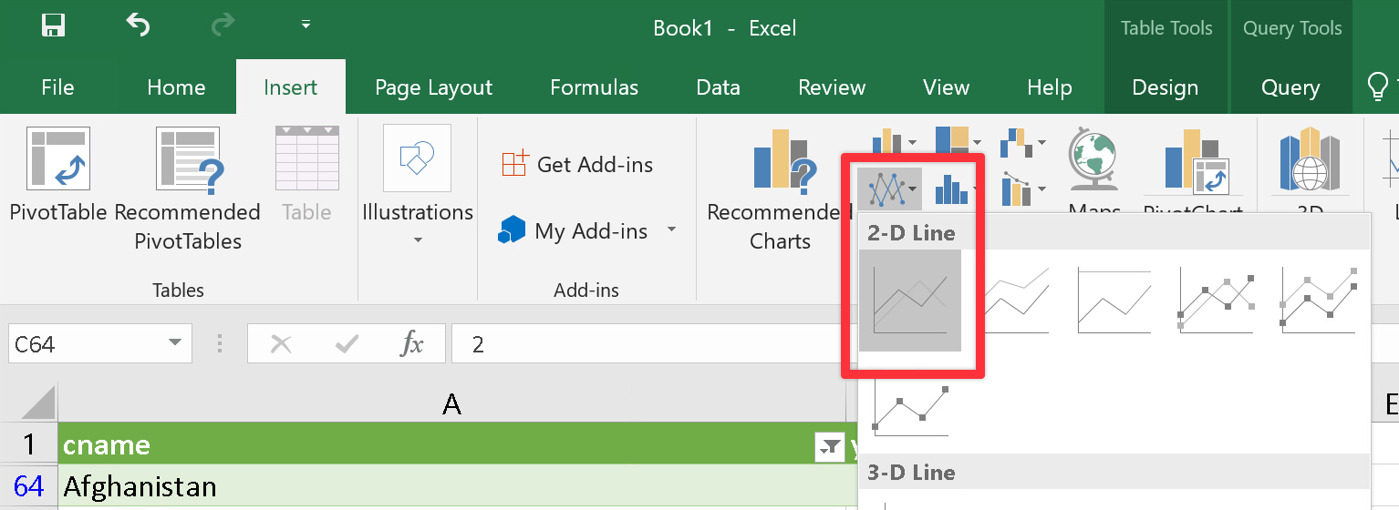
Now that you have a nice clean and filtered subset of data, you need to plot it! We want to create a plot that shows trends in this indicator over time, with a line per country. We can do this in Excel by building the plot up a country at a time.
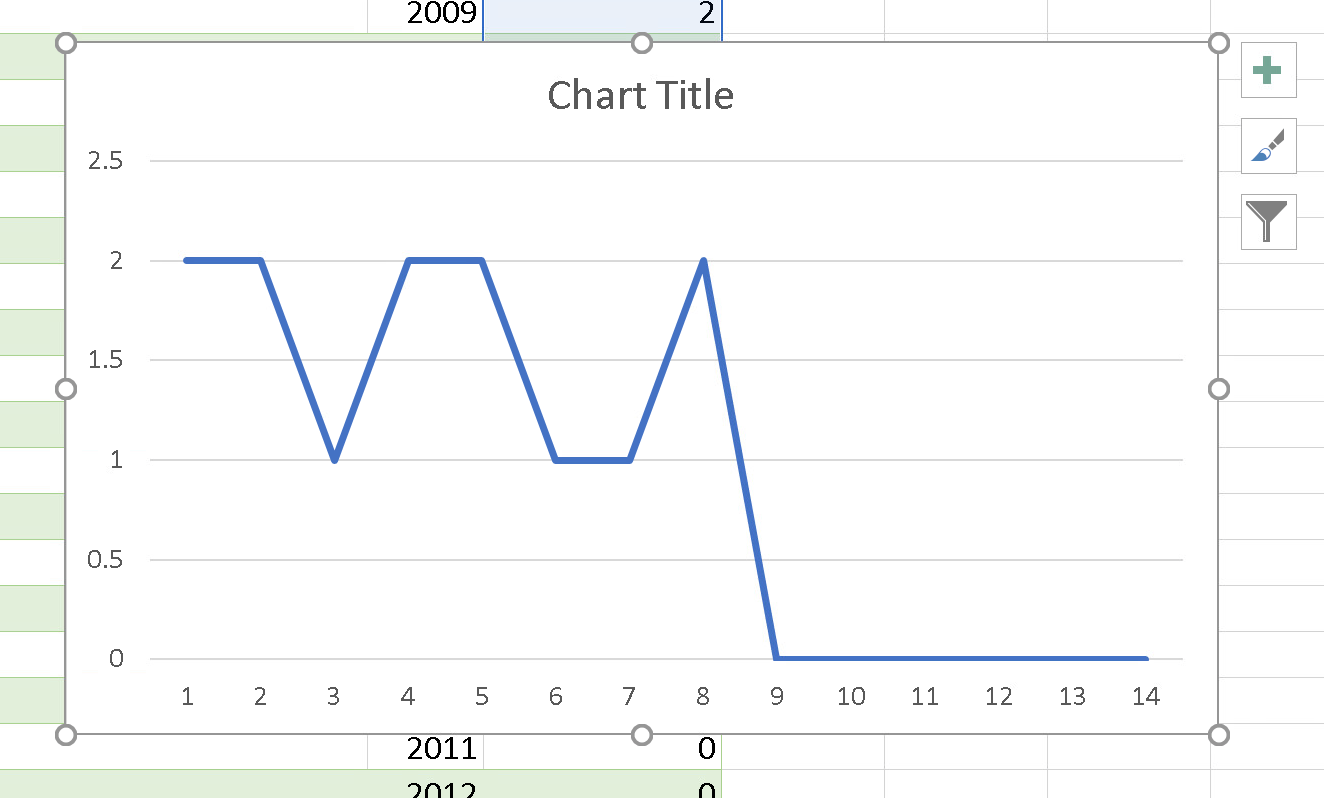
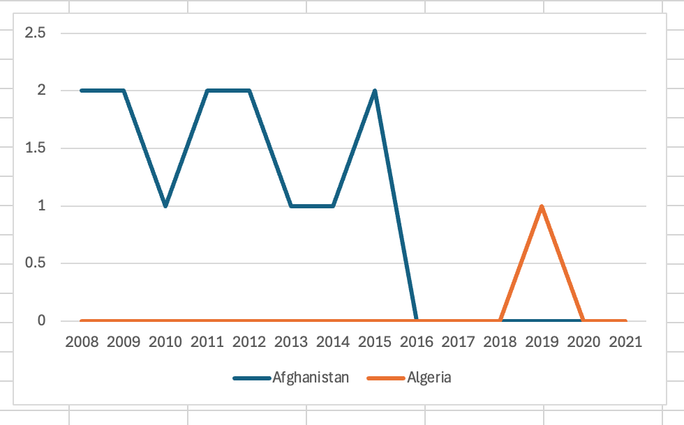
Select only the governance indicator values for the first country:
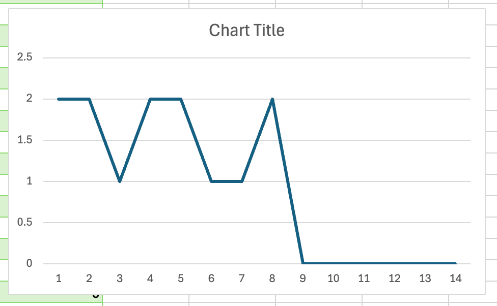
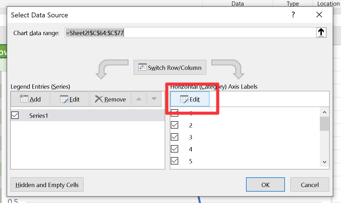
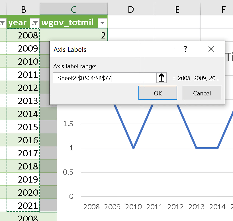
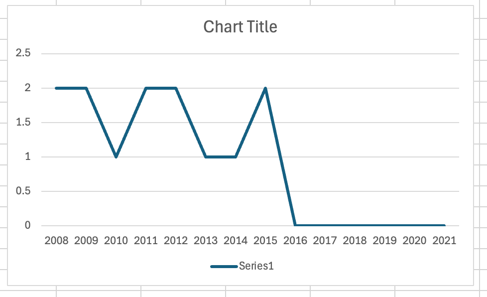
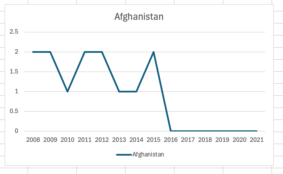
You’ll get a chart with the indicator values over time (yay!), but it’s not great (boo!). The x-axis has numbers instead of years, and there’s no legend showing what country this line represents.
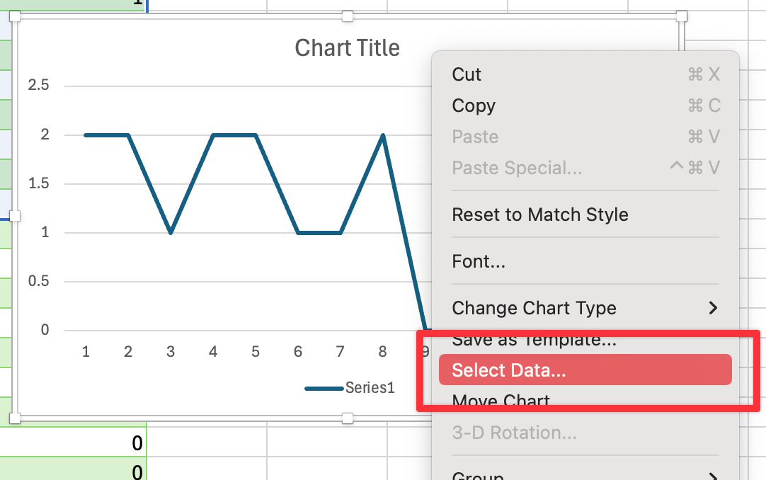
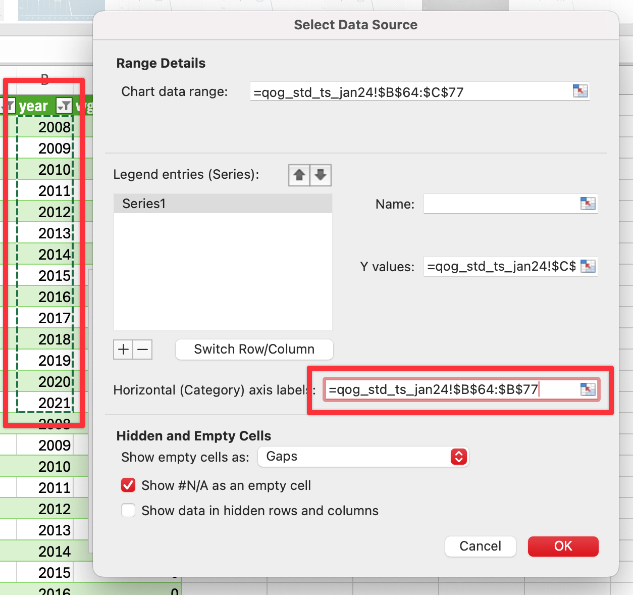
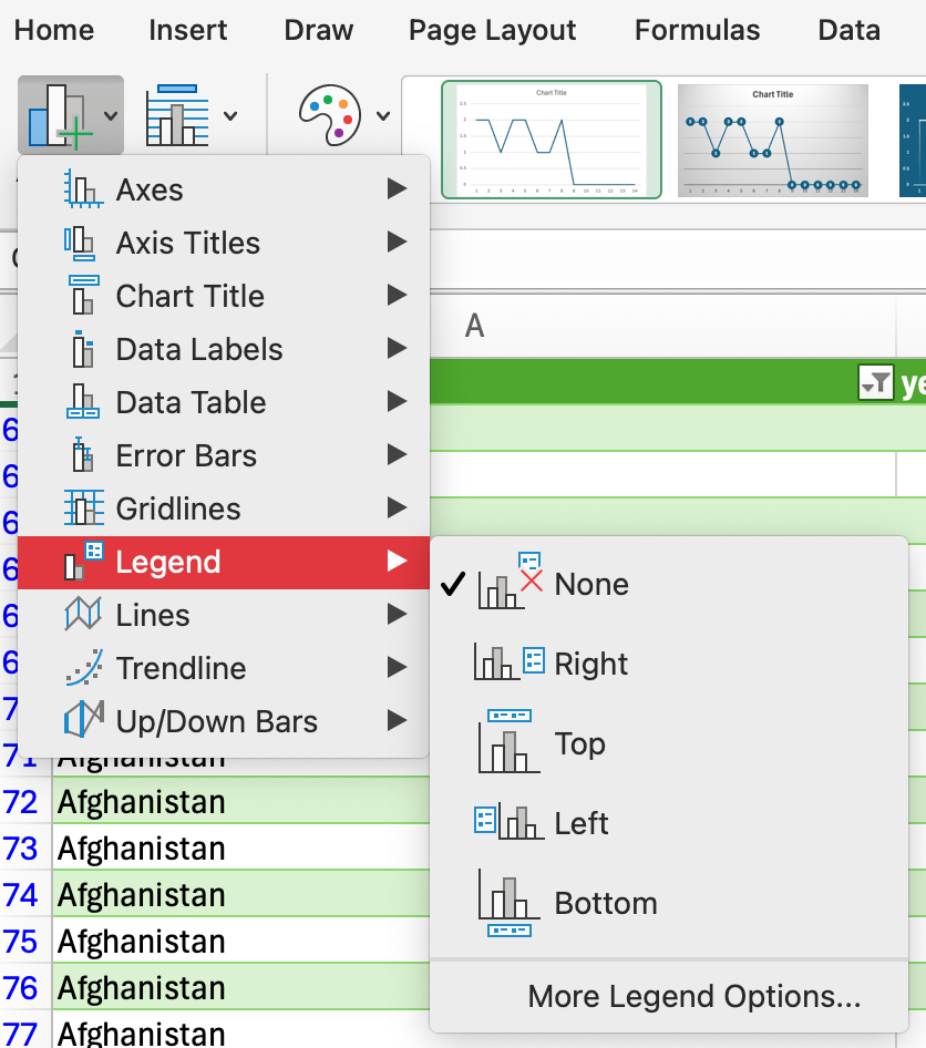
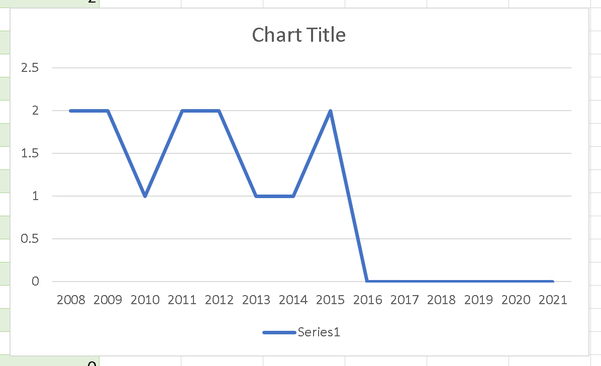
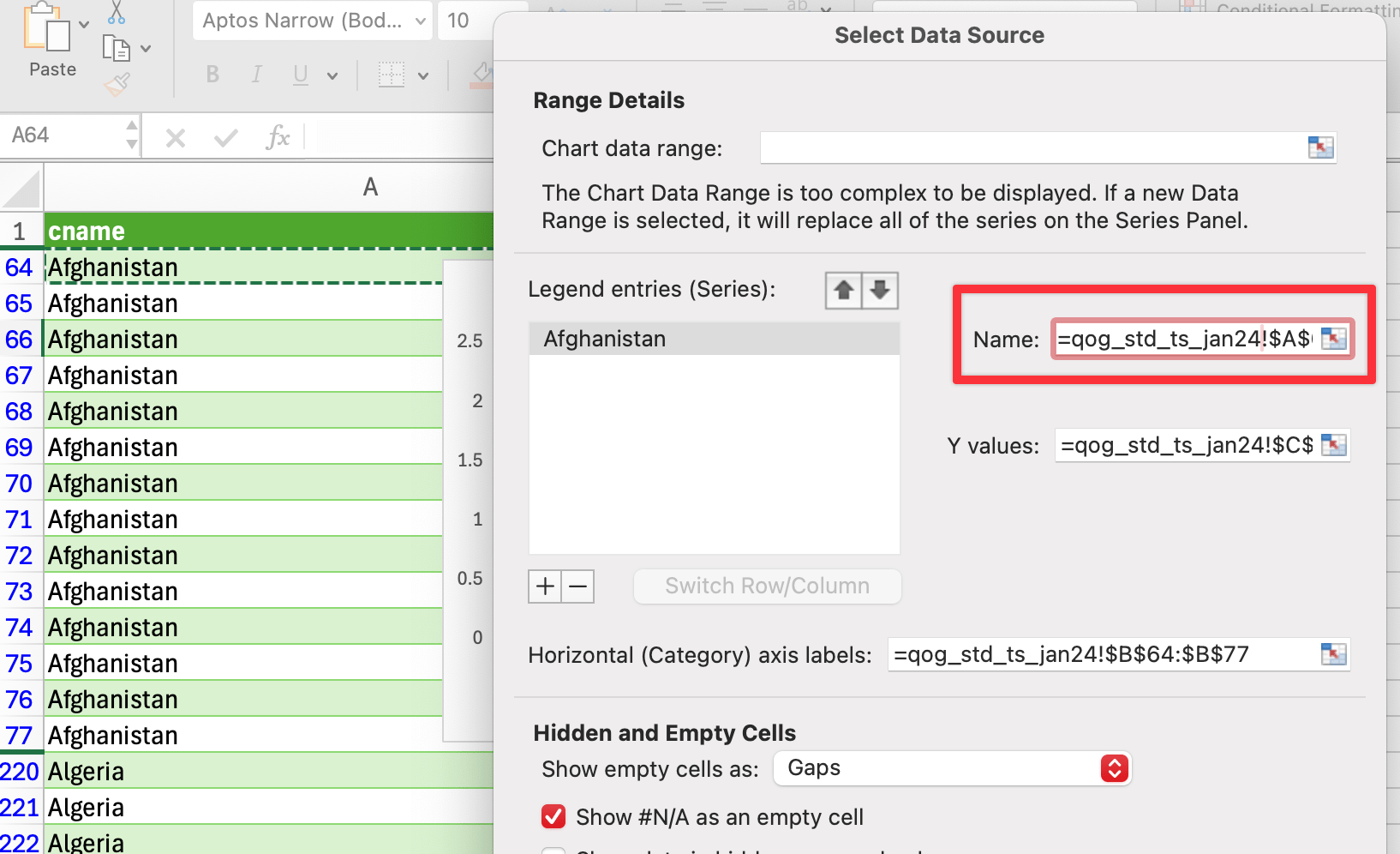
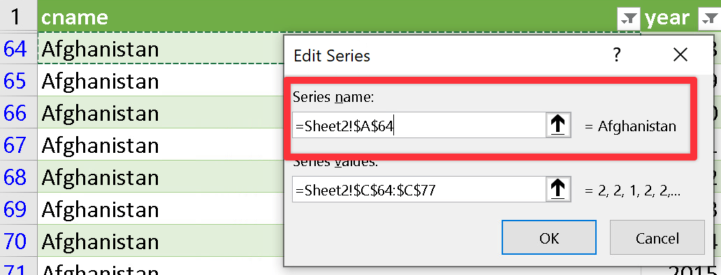
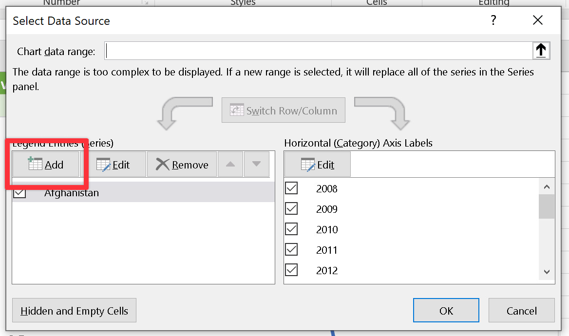
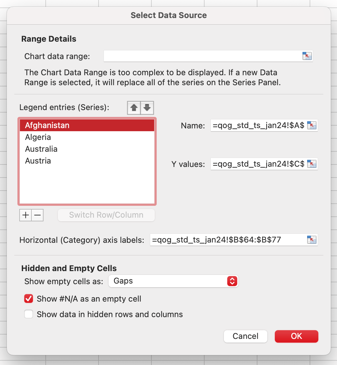
The legend, though, isn’t great. It says “Series1” instead of the name of the country. We can fix that by right clicking on the chart and choosing “Select Data…”. In the settings for the data series, point the “Name” field to one of the cells in the data:
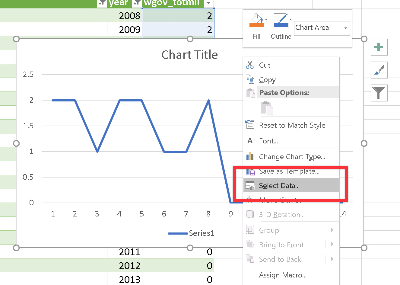
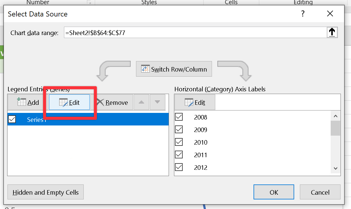
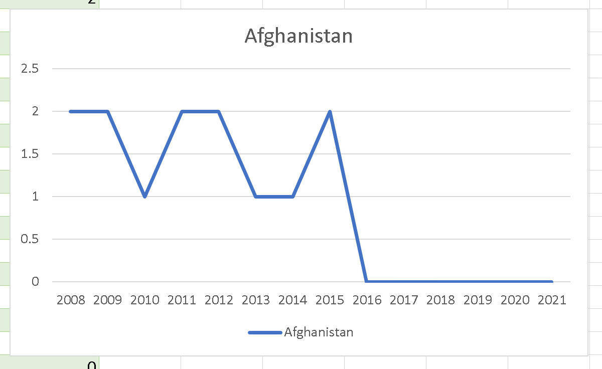
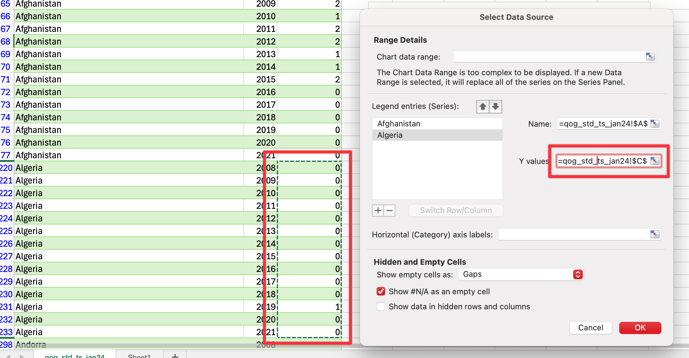
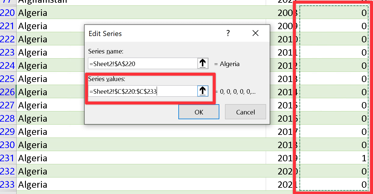
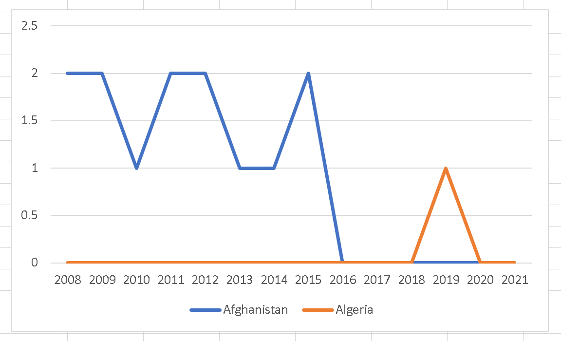
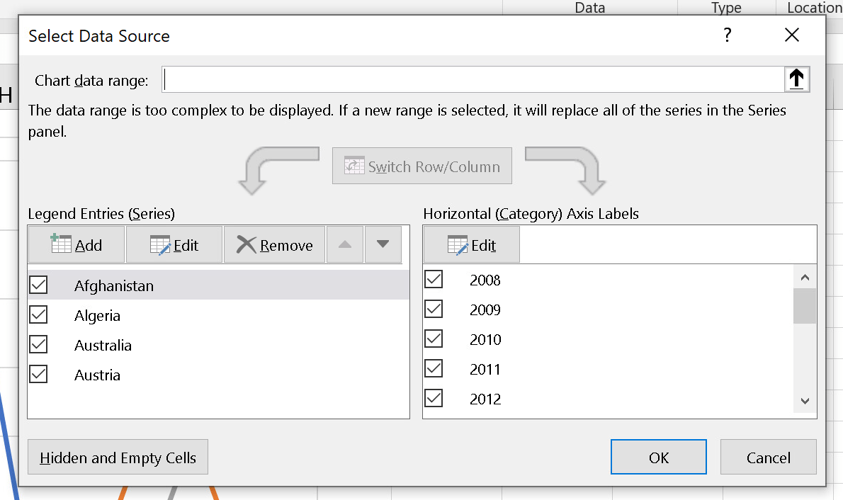
To add the next country, right click on the chart and choose “Select Data…”. Add a new series and select the next country’s indicator values (and change the name of the series accordingly, like earlier):
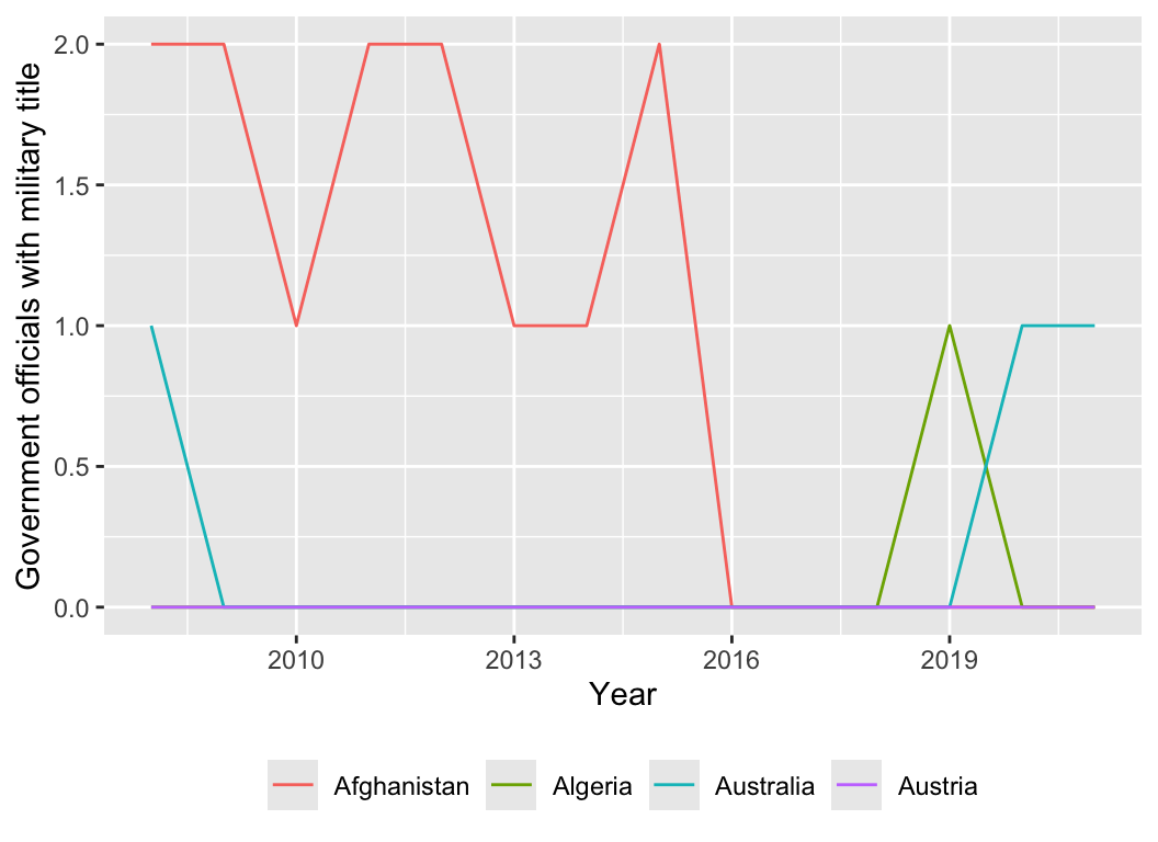
Since the QoG data is already structured for statistical software, you can do all this importing and plotting work a lot faster if you know R.
Here’s a quick example of how (this assumes you’re familiar with R):
library(tidyverse)# The {rqog} package lets you download data directly from the QoG project# remotes::install_github("ropengov/rqog") # Install the package from GitHublibrary(rqog)# Get the standard time series data from QoGqog_standard <-read_qog(which_data ="standard", data_type ="time-series", data_dir ="temp")# Select just some columns, countries, and yearsqog_subset <- qog_standard |>select(cname, year, wgov_totmil) |>filter(cname %in%c("Afghanistan", "Algeria", "Australia", "Austria")) |>filter(year >=2008, year <=2021)# Look at the first few rowshead(qog_subset)
# Plot the dataggplot(data = qog_subset,mapping =aes(x = year, y = wgov_totmil, color = cname)) +geom_line() +labs(x ="Year", y ="Government officials with military title", color =NULL) +theme(legend.position ="bottom")
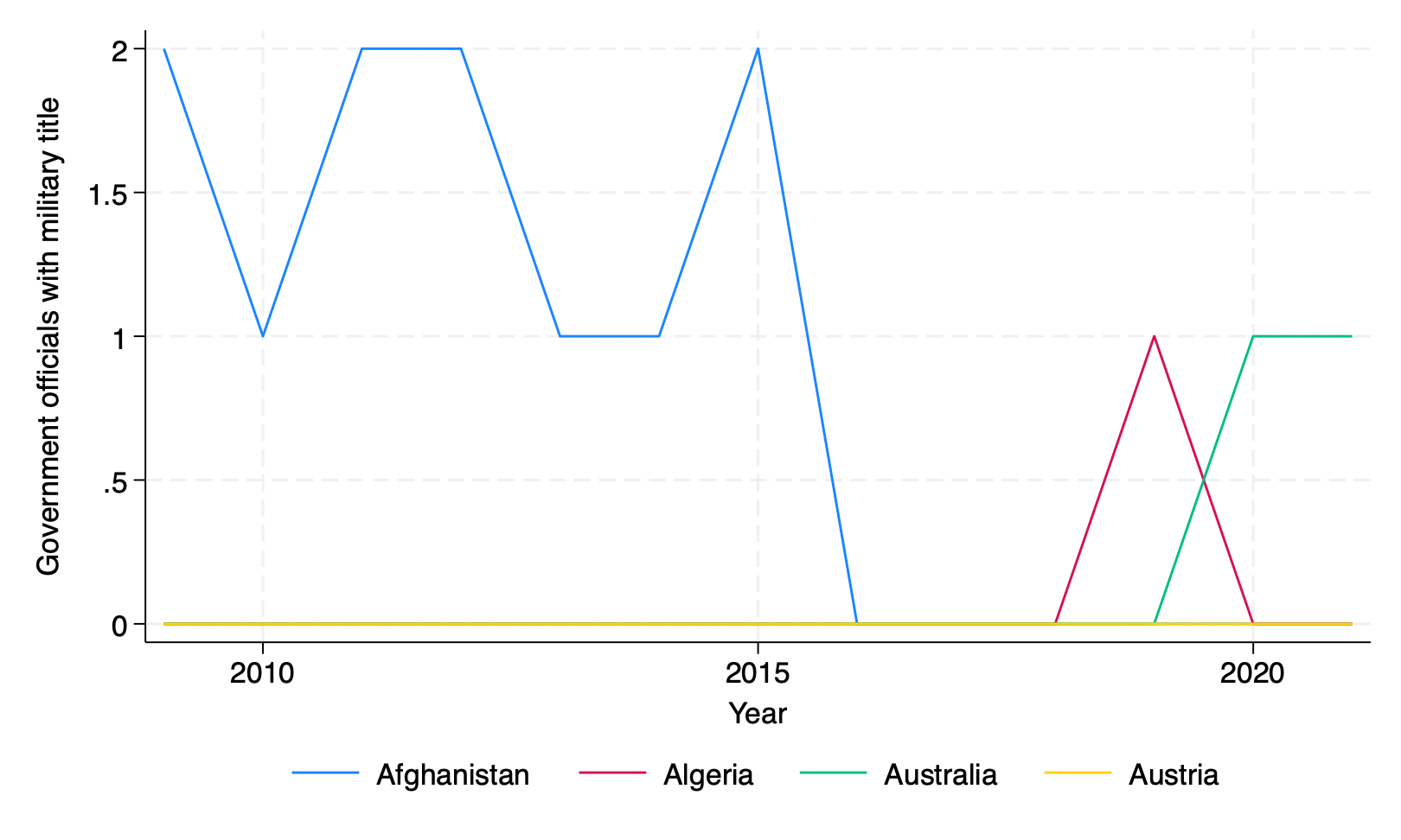
Plotting QoG data with Stata
Since the QoG data is already structured for statistical software, you can do all this importing and plotting work a lot faster if you know Stata.
Here’s a quick example of how (this assumes you’re familiar with Stata):
// There's no automatic way to get QoG data into Stata like with R, so download // the standard time series Stata file from the QoG website firstuse"qog_std_ts_jan24_stata14.dta", clear// Select just some columns, countries, and yearskeep cname year wgov_totmilkeepifyear >= 2008 & year <= 2021keepifinlist(cname, "Afghanistan", "Algeria", "Australia", "Austria")// Look at the first few rowslistin 1/8